The Mobilize Rescue app helps untrained bystanders assess, manage and monitor a spectrum of medical emergencies — while the ambulance is en route.
The use of bright/bold buttons, large type, illustrations with minimal detail, short/deliberate instructions, familiar language, and little to no video or sound(so that users are not rushed because of running video and audio) is intended to enable users to open the app for the first time, with no training, or prior medical experience and successfully asses, manage, and monitor victims by following the simple prompts, visual cues and instructions during a stressful situation.
My role was to strategically plan, design and organize wireframes, UI/UX, illustrations (300+), user testing and flow charts for the 1000+ page diagnostic app as well as collaborate and manage the software team.
Creative Direction | Brand Integrity | Project Management | UI/UX/CX | Product Development | Digital Illustration | Content Development
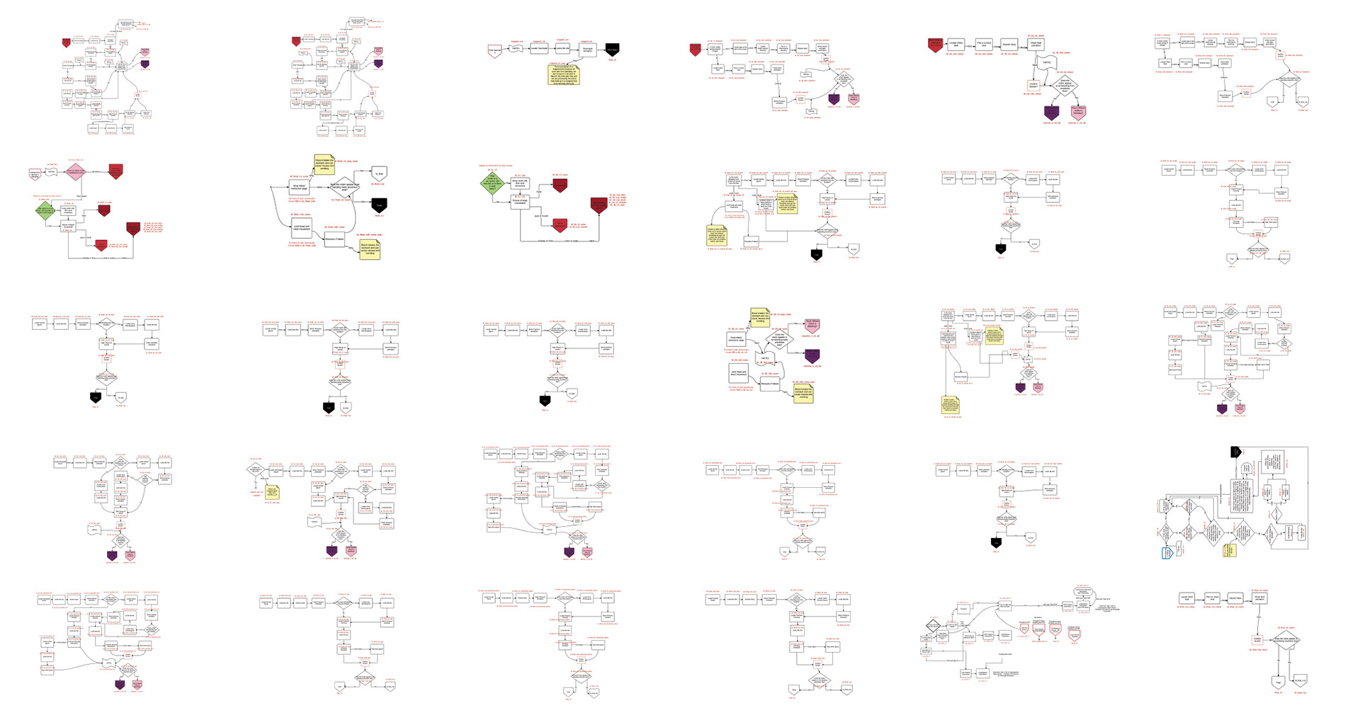
Over 50 flow charts had to be created, following the MARCHE (Massive hemorrhage control, Airway management, Respiratory management, Circulation, Hypothermia, Everything else) algorithm. The flow and algorithm ensure users will treat critical life threats first.
I worked with Subject Matter Experts to create content, flows, and illustrations.


Mobile Application
The mobile app is a paired down version of the full tablet app and functions with the Compact and Public Access Rescue Systems. The UI is modified but follows the same color scheme, language, algorithm, content, illustration style, and treatment philosophy.
Mobilize Web portal
Mobilize Administrators: Can create new products or licensing codes and track expiration dates and service plans.
Customers: Can watch videos, view manuals and support documents, see product contents and expiration dates and reorder used or expired supplies.
